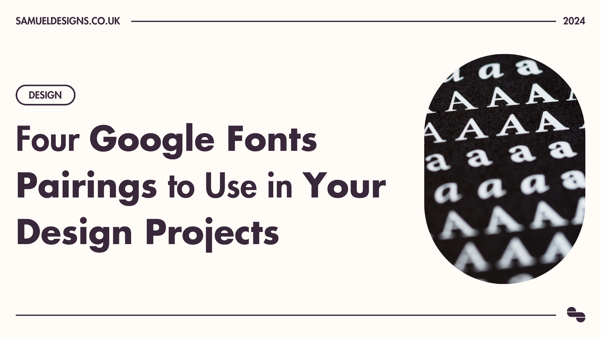
Four Google Fonts Pairings to Use in Your Design Projects
If you don’t already know what Google Fonts is (which would be weird considering you’re reading an article about font pairings), it’s a huge repository of font families that are free to use in both personal and commercial projects.
In fact, this is such a handy tool that it made its way onto the list of design resource sites that all designers need to use!
With over one thousand different typefaces to play with, it can be a tricky business to find the perfect match. It should come as no surprise, what with me being a graphic designer and all that, that I’ve spent plenty of time scouring through Google Fonts in search of the elusive perfect pairing. Here are four of the best combinations I’ve found so far…
Open Sans & Montserrat

If you’re looking for an all-purpose sans-serif font pairing for your project, Open Sans and Montserrat is a fantastic choice. These are two of the most versatile typefaces in the whole Google Fonts collection, making them perfect for large blocks of text, as well as being bold and striking enough for headlines!
Oswald & EB Garamond

Oswald is a very striking typeface. The heavy variants are bold and eye-grabbing, whilst the lighter variants are surprisingly versatile, creating a unique choice for a main body font.
EB Garamond is a reworking of the classic (and much loved) Garamond typeface. It’s an extremely elegant serif font, which works exceptionally well in large, printed chunks of text. This instantly recognisable font is an excellent choice for almost any project.
The combination of both Oswald and EB Garamond creates a nice balance between the classic and the modern. For me personally, this font combination would excel when being used in tandem, with Oswald handling the headlines, and EB Garamond taking care of the body text.
Montserrat & Merriweather

It’s pretty much impossible to be an internet user in 2024 and not have come across Montserrat at some point. This is for good reason. Montserrat has cemented itself as a designer favourite for both its simplicity and versatility.
Combining the simplicity of Montserrat with the striking serifs of Merriweather is sure to be a winner! From experience, both can be used interchangeably with either Merriweather being used for headlines, and Montserrat for body, or vice-versa!
Raleway & Roboto

I personally love the combination of Raleway Light for body text, and Roboto Black 900 for bold, striking headlines! I’ve found that the combination of these two stunning typefaces works best on simple, two-tone backgrounds, ie white background and black text.
This simplistic colour scheme really helps to put focus on the typefaces, accentuating the features of both these stunning fonts!
There are plenty (and I mean plenty) more combinations that could be listed here, and I’m sure there are stunning pairings that I don’t even know about! However, these four are ones that I use regularly in my work, so can vouch for their versatility!
If you’re interested in learning more about typography, some fantastic books on the subject can be found in the list of six books that ALL graphic designers need to read!


![Affirmations for Graphic Designers to Help You Keep Going [INFOGRAPHIC]](https://images.squarespace-cdn.com/content/v1/5cfebab7bfcecb000194cc60/1711646088600-495MRCVU0Y8Y9GS07B7A/05+-+Cover+-+Affirmations+for+Graphic+Designers+to+Help+You+Keep+Going.png)
![Colour Psychology: What Colours Mean Around the World [INFOGRAPHIC]](https://images.squarespace-cdn.com/content/v1/5cfebab7bfcecb000194cc60/1711645558379-2W1EOZ0VHHFYZOL9OIV9/04+-+Cover+-+Colour+Psychology+-+What+Colours+Mean+Around+the+World+%5BINFOGRAPHIC%5D+.png)


