Learning Graphic Design: A Crash-Course For Beginners in Graphic Design
Introduction
When you first enter the world of graphic design it can sometimes feel overwhelming when you’re greeted with a bunch of keywords and terms you’ve never heard of. I wanted to take the time with this post to break down some of these words and terms you’ll come across when learning graphic design.
We’ll start with the Core Principles of design, explaining the terms, what they mean and showing some examples of each. We’ll then move into quick explanations of the various forms of graphic design, plus various tools you can use to achieve certain styles and end products. At the very end there’ll be a list of helpful resources that I use fairly often, and that I think will be beneficial to those of you just getting into graphic design.
Core Principles
There are a number of core principles to keep in mind when working in graphic design. It’s important to learn and understand each of them not only for when you’re working on your own projects, but also when you’re giving critiques, communicating with clients and discussing graphic design in general.
Even if you’re completely new to the world of graphic design, I’m sure that you will have come across some of these terms before, but we’ll go through them here, as some of the meanings may not be immediately clear.
Balance
Balance refers directly to the stability and the structure of the visual elements within a piece of design work. Imagine that each element on the page has its own “weight” and as such, will need to be counterbalanced with other elements with similar weights. This would be symmetrically balanced design.
A design doesn’t, however, always need to be symmetrically balanced. If, for example you don’t want to opt for something symmetrical, you can instead go for an asymmetrical design. This type doesn’t simply use the elements on the page to balance the composition, but instead implements things like colour, contrast, scale and texture.
Having a solid understanding of balance, both symmetrical and asymmetrical, will allow your work to have a more defined, aesthetically pleasing look, as well as help it achieve a cohesive feel and flow.

Example of symmetrically balanced design. Another World by Samuel J. Stroud. Taken from the Daily Posters project
Proximity
This refers to the distance between the elements. It’s important to understand that keeping a good amount of distance between the main parts of your design will stop the overall product from looking too cluttered and messy.
There’s often a relationship between the elements linking them all together. Thinks like typography, font, colour, size, shape and more help to establish the relationship and the overall cohesion of the elements.

Example of proximity being used. Not the similarities between colours, as well as general shapes. Suprematism by Samuel J. Stroud. Taken from the Daily Posters project.
Alignment
Thinking about the alignment of elements in your work is incredibly important when creating a design. This is especially important when creating something like a flyer or a poster that’s very type heavy. You generally don’t want to mix different alignment types, because doing so makes the end product look messy and amateur.

Example of central alignment. Example used is my 2019 digital design flyer. Source: Twitter.
Visual Hierarchy
All elements should have their own place in the visual hierarchy. This refers to, essentially, the order of the elements on the page. For example, the element that you want to have the most attention should be the largest thing on the page, with other information becoming less bold.
Think about an article. You wouldn’t expect the title to be smaller than the main text. This is because the title is designed to quickly show the reader some information about the article, as to allow them to quickly discern if they want to read on/if the article is of interest to them.

Example of visual hierarchy. Notice how each the two main focuses, the title of the album and the release date, are the largest text on the page. Design by Samuel J. Stroud.
Repetition
Repetition is one of the best ways of creating a uniform and recognisable look for a brand, website, magazine, etc. It works but repeating established elements of a design in order to bolster the overall cohesion of the product.
Think about a website. You’ll typically see a strong colour scheme used across the entire site, on all of the pages. This repeating of the colours both allows the overall design to be recognisable as a brand, as well as the site being user friendly.
Nothing will damage an otherwise good design than not working with a standard set of elements. There’s nothing worse than visiting a website that uses a million different colours, in a whole bunch of different styles.
Things to consider when implementing repetition in your design are colour schemes, fonts, images and logos.

Example of repetition. This is a blog concept I designed a while ago. Notice the repetition of the posts, as well as the cohesive colour scheme and fonts. Designed by Samuel J. Stroud.
Contrast
Contrast is the distinction between two opposing elements on a page. The most common variant you’ll see when working with contrast is Dark vs. Light. Typically, the background of a design will be a dark colour, whilst the main focus (often text) will be in a light colour. Good use of contrast in your work will really help elements stand out.
Keep in mind that this use of Dark Vs. Light, when being used with text, is only really appropriate when working with a small amount of text. Light text on a dark background doesn’t work with big chunks of text. If you’ve ever tried to read white text sat on a pure black background you’ll know what I mean.

Example of contrast. Identity by Samuel J. Stroud. Taken from the Daily Posters project.
Colour
Working with colour, and being able to pick tones that accurately represent the mood of a product (or whatever the focus of the design is) is an essential skill that all graphic designers need.
You need to have an understanding of what each of the primary (and secondary colours) mean and represent, as well as how they are interpreted by our brains when we see them. Each colour radiates feeling and emotion, and has a huge effect on how an overall design is perceived.
https://www.samueldesigns.co.uk/blog/colours-and-how-theyre-interpreted-
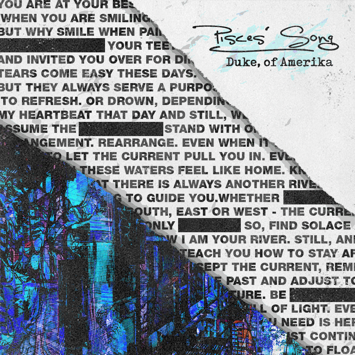
Example of good use of colour. Note that the design plays on the “Pisces” iconography and connotations with the heavy use of blue. Designed by Samuel J. Stroud.
Negative Space
This is moving slightly into slightly more advanced principles, but still something that you should keep in mind when beginning to work with graphic design.
Negative Space refers to the space in a composition that’s left blank. When using this empty space creatively, you can create shapes as well as highlight important aspects of your design.

Example of a minimal use of negative space. Notice how the combination of the red and the negative space around create a camouflage effect. Hidden in Plain Sight by Samuel J. Stroud. Taken from the Daily Posters project.
Typography
Understanding how to use lettering and type is one of the cornerstones of graphic design. Well thought out typography speaks volumes about a brand or artwork. Sometimes, all you need is type to create a stunning design. Considering that the type is often the main focus of a poster, flyer, banner or pretty much anything else, having clean and legible (and sometimes customized) type is essential.

Example of typography. Notice that simply with the combination of well placed type and various shades of one colour, you can create a very striking visual design. Subtle by Samuel J. Stroud. Taken from the Daily Posters project.
Break the Rules!
Once you’ve got yourself a solid grasp on the fundamental rules mentioned above, you can start to subvert and break them!
It’s essential to work with these boundaries and core concepts in your work, doing that will ensure that you create something that’s both easily understandable and aesthetically pleasing. However, like I said, there’s nothing wrong with breaking the mold every once in a while.
Pushing the boundaries, or ignoring them altogether, is a very handy exercise when learning to think outside the box. Doing this gives you new ways of thinking, new ways of solving problems and pushing yourself creatively that you just can’t get when you’re working within the constraints of the core principles.

Don’t Be Afraid to Experiment by Samuel J. Stroud. Taken from the Daily Posters project.
Types of Graphic Design
I broke these down in a previous post entitled The 8 Types of Graphic Design, but I’ll run through them again here quickly. I do recommend checking out that other post if you want some more detailed explanations of each, as well as some visual examples!
Branding & Identity Design
This is the creation of a brand, business or service identity. Think about Apple, they have the iconic bitten apple logo, the minimal design and the sleek colours. That’s their identity.
Environmental Design
Design that can be seen in and around public spaces. Think about any murals on walls in cafes or signage in an office.
Motion Design
Any form of design that is in motion. This can be things like animated logos, title sequences and GIFs.
Interface Design
Interface Design, often broken down into UI (User Interface) and UX (User Experience) refers to the design of, naturally, a user interface. Think about when you use your phone, you’re actually using an interface that a team of people have worked on to ensure it’s easy to use and visually appealing.
Packaging Design
This is what the name suggests. Does what it says on the tin, so to speak. This refers to the design of any packing, will often incorporate a product or brand’s Identity Design, making use of colour, font, logos, etc.
Publication Design
This refers to the design and layout of any formal publication, which can be both physical and digital. Think about the layout of a newspaper or a magazine. This will take into consideration colour, typography, composition and more.
Marketing Design
Marketing Design can be anything that’s sole purpose is to market a product, brand, business, event or service. These can often be in the form of posters, banners, animated web ads, vehicle wraps and more.
Art & Illustration
Although not necessarily a form of design as such, it’s been included in this list as it’s often mentioned when discussing design. This refers to any form of bespoke artwork that is created, often for a product. Think about the character, item and location illustrations in Dungeons & Dragons, for example.
Tools
There are hundreds of different tools that one can use when working on anything to do with graphic design. Although this should be obvious, I’ll say now that I’m only going to be listing digital design tools. If you’re here looking for things like rulers, pencils and the like, you’re out of luck. Sorry!
I’ll categorise things by type, and list whether or not they are paid services/products. Anything that I personally recommend will also be labelled.
Logo Design
Most people will be quick to tell you that Adobe Illustrator is the absolute best tool available for logo design. Of course, it is incredibly powerful, but realistically it doesn’t matter what you use. So long as the software you choose allows you to work with vector design, you’ll be fine. Take some time to play around and find something that works best for you.
Adobe Illustrator (Paid) My personal recommendation.
https://www.adobe.com/uk/products/illustratorInkScape (Free)
https://inkscape.org/Vectr (Free)
https://vectr.com/SVG-Edit (Free)
https://github.com/SVG-Edit/svgedit
Web/App Design
When I first started designing websites the number one tool you could have was Adobe Photoshop. To an extent, you can still work with it when putting together web/app designs, but there are now much more powerful tools built specifically for this job.
Figma (Free) My personal recommendation
https://figma.comFramer (Free)
https://framer.comSketch (Paid)
https://www.sketch.com/Adobe Dreamweaver (Paid)
https://www.adobe.com/uk/products/dreamweaverAdobe Photoshop (Paid) If you’re already familiar with the Photoshop interface, there’s nothing wrong with using this.
https://www.adobe.com/uk/products/photoshop
Web/App Development
(Included in case you’re interested in development too)
I’ve used so many development tools over the years.Technically speaking, you can build webpages, and entire websites, using the built in notepad apps in Windows or MacOS, although I wouldn’t recommend it. What I would recommend are the apps below.
Atom (Free) My personal recommendation
https://atom.io/Adobe Dreamweaver (Paid)
https://www.adobe.com/uk/products/dreamweaverNotepad++ (Free)
https://notepad-plus-plus.org/
Publication Design
As is the same with web design, you can still use Photoshop for this job, but again, there are specific tools built for the job .
Adobe InDesign (Paid)
https://www.adobe.com/uk/products/indesignMicrosoft Office Publisher (Paid)
https://products.office.com/en-us/publisherScribus (Free)
https://www.scribus.net
Photo Manipulation
I’m only going to include one program on here, because it’s, in my opinion, still the best available for large scale photo manipulation.
Adobe Photoshop (Paid)
https://www.adobe.com/uk/products/photoshop
Photo Editing
If you’re looking to edit the colours, some texture, and in general enhance your photography work, there are plenty of tools for that.
Adobe Lightroom (Paid)
https://www.adobe.com/uk/products/photoshop-lightroomAdobe Photoshop (Paid)
https://www.adobe.com/uk/products/photoshopLightZone (Free)
http://lightzoneproject.org/RawTherapee (Free)
http://rawtherapee.com/GIMP (Free)
https://www.gimp.org/downloads/
Video Editing / Motion Design
I’ve included video editing and motion design in the same list because the majority of tools can handle both.
Adobe AfterEffects (Paid)
https://www.adobe.com/uk/products/aftereffectsMAXON Cinema 4D (Paid)
https://www.maxon.net/en/products/cinema-4d/overview/Sony Vegas (Paid)
https://www.vegascreativesoftware.com/gb/Final Cut Pro (Paid, Apple only)
https://www.apple.com/uk/final-cut-pro/
Art & Illustration
I didn’t know much about the tools used in this area. Not being an illustrator, I don’t really have any need to use any of them, with the exception of Adobe Illustrator. This is a list of the most common recommendations I got from illustrator friends of mine.
Adobe Illustrator (Paid)
https://www.adobe.com/uk/products/illustratorAffinity Pro (Paid)
https://affinity.serif.com/en-gb/photo/CorelPainter (Paid)
https://www.painterartist.com/en/product/painter/CorelDraw (Paid)
https://www.coreldraw.com/en/product/coreldraw/InkScape (Free)
https://inkscape.org/
3D Design
There are a bunch of different digital tools with the purpose of creating 3D models. This list is going to be focused only on 3D art, not CAD software.
Cinema 4D (Paid) My personal recommendation
https://www.maxon.net/en/products/cinema-4d/overview/Blender (Free)
https://www.blender.org/Maya (Paid)
https://www.autodesk.co.uk/products/maya/overview
Helpful Resources
There are a million and one different websites, tools and books that all claim to help you when learning graphic design. Sure, a lot of them will be helpful, but there’s no way you’ll have the time to sift through everything to find the best resources.
I’ve put together a list of some websites and books that I think will help you in getting to grips with graphic design. These include things like stock photos, fonts, inspiration repositories and books on various aspects of graphic design. All of the websites listed are tools that I use on an almost daily basis, so I recommend all of them!
Assets
Pexels (Stock Photos) - https://www.pexels.com/
Vexels (Vectors) - https://www.vexels.com/
Noun Project (Icons) - https://thenounproject.com/
Pixiden (Mockups) - https://www.pixeden.com/
FontSquirrel (Fonts) - https://www.fontsquirrel.com/
Google Fonts (Fonts, Dev Specific) - https://fonts.google.com/
Inspiration
Niice - https://niice.co/
Pinterest - https://pinterest.com
Adobe Color CC (Colour Palettes) - https://color.adobe.com/
Beeple (Incredible 3D Artist) - https://instagram.com/beeple
Baugasm (Daily Posters) - https://instagram.com/baugasm
I wrote a longer post about how to go about finding inspiration here, so I recommend checking that out when you get a chance!
Books
How to be a Graphic Designer, Without Losing Your Soul - Adrian Shaughnessy
Thinking With Type - Ellen Lupton
Designing Brand Identity: An Essential Guide for the Whole Branding Team - Alina Wheeler
Making and Breaking the Grid: A Layout Design Workshop - Timothy Samara
Elements of Graphic Design- Alex White
Final Thoughts
Hopefully all of that should make the task of learning graphic design a little less daunting. There’s still a lot (a lot) more outside of what’s listed here, but once you’ve got an understanding of the basics, moving on to the most complex and advanced areas won’t be anywhere near as tricky!
I’ll also be working on a few more posts like this, with some tips on how to go about putting what you’ve learnt into practice, what to do when you’ve hit a design block, and even more, so be on the lookout for those!
I know that there’s a lot of information to take in there, but I wanted to list as much as I could without it becoming too overwhelming. I also specifically opted against splitting these up in multiple posts, as nothing annoys me more than having to click through a bunch of pages when everything should all be together.
Are there any other topics that you’d like to see covered here? If so, then please let me know via the contact page, and I’ll see what I can do!
As you can see from being on this site, I’m also a freelance graphic designer, so if you need help with any projects you’re working on, I’d be more than happy to get involved! I’m currently available for both short and long term hire.
Thanks for reading!